Android XML: User interaction - Button
In this lesson, we will explore how to add a Button and TextView elements in Android. A Button is a standard component in Android that consists of both text and a background/image.
Why am I emphasizing this? In Android, all elements have a background, and the ability to handle touches and clicks is given by the most basic View. What does this mean? If we look at the Button documentation, we can see that the Button class inherits from the TextView class, which in turn inherits from View.
In Android, we have very extensive inheritance chains. This is done to have the ability to extend and add functionality to existing elements. This is precisely what we see with the Button example, which adds functionality to TextView, specifically just two methods:
- public CharSequence getAccessibilityClassName ()
- public PointerIcon onResolvePointerIcon (MotionEvent event, int pointerIndex)
This is done for people with disabilities and for devices that can use various devices for control, such as a mouse, pen, or remote control.
We've finished the theory; let's try it in practice. In our already created project, let's replace the TextView tag with a Button in the activity_main.xml file:
<?xml version="1.0" encoding="utf-8"?>
<androidx.constraintlayout.widget.ConstraintLayout xmlns:android="http://schemas.android.com/apk/res/android"
    xmlns:app="http://schemas.android.com/apk/res-auto"
    xmlns:tools="http://schemas.android.com/tools"
    android:layout_width="match_parent"
    android:layout_height="match_parent"
    tools:context=".MainActivity">

    <Button
        android:layout_width="wrap_content"
        android:layout_height="wrap_content"
        android:text="Start Develop"
        android:textSize="48sp"
        android:textColor="#FF0000"
        android:textStyle=""
        app:layout_constraintBottom_toBottomOf="parent"
        app:layout_constraintEnd_toEndOf="parent"
        app:layout_constraintStart_toStartOf="parent"
        app:layout_constraintTop_toTopOf="parent" />

</androidx.constraintlayout.widget.ConstraintLayout>
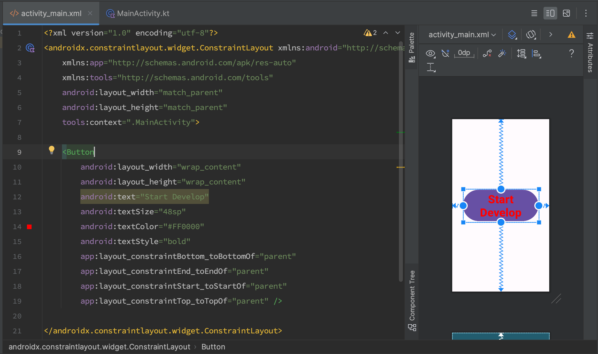
And we see the following result:

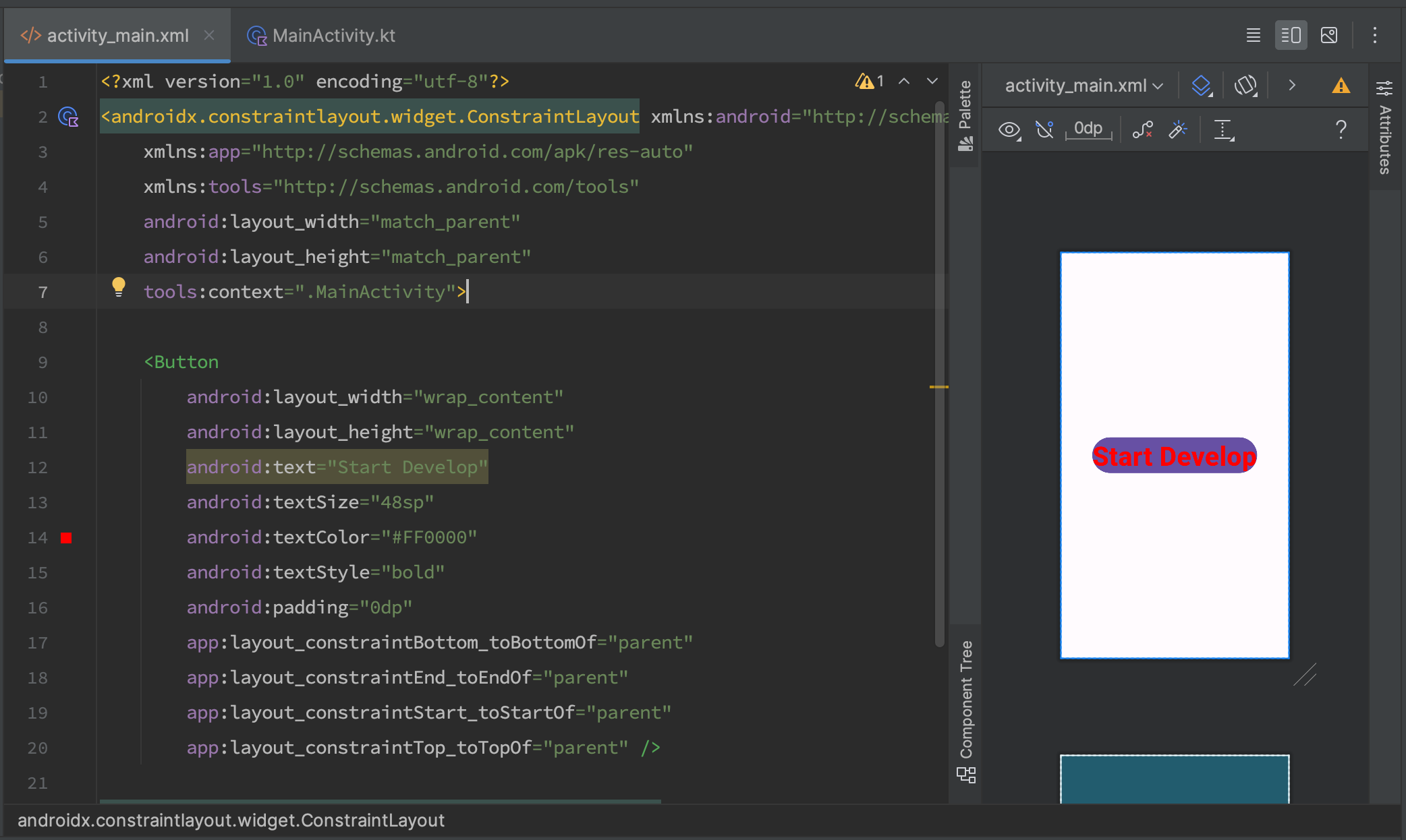
We can see that the text settings have been preserved. A background and a line break have been added (not all readers will see the line break). The line break is related to the appearance of the background. In Android, the background affects the position of the content, and a Button can have its own default settings. These settings are available in TextView and other elements as well. But by default, each element has its own values for these settings. For example, padding, which controls the space inside the element from the edge to the content, in our case, the "Start Develop" text.
Let's add the android:padding="0dp" attribute to our button and see the following result:

Did you notice that we set the padding attribute to "0dp"? Why not "sp"?
Android has its own mechanisms for calculating the size of elements. This is related to how many pixels a device has and what its physical size is. This is precisely what the unit DP - Density-independent Pixels - meaning the size in abstract pixels depending on the physical size of the screen, rather than the number of pixels. It is through this mechanism that we can often design our layout once, and the application looks the same on both large and small devices.
In general, Android has many units of measurement, but you need to remember the two main ones: SP for text size and DP for the size and spacing of elements.
REMEMBER! Text size values are always set in SP units. Values for dimensions, such as width, height, and margins, are set in dp units!
That's it. We've covered how to use the Button. We found that the Button and TextView are very similar to each other and use the same XML attributes.
Have a question? Ask our community in Telegram - Start-Develop RU / Start-Develop EN