Android XML: DIsplay text - TextView
So, you've created a project, launched it, familiarized yourself with the project structure, and Android Studio elements. You've learned the basic attributes for all views and even modified TextView. Let's delve into what TextView can do and how to modify it. Here are the main attributes of TextView that you can modify:
Basic attributes that exist for all views and containers:
- android:background: Sets the background of TextView.
- android:padding: Sets the internal padding of the text from the borders of TextView.
- android:layout_width and android:layout_height: Sets the width and height of TextView.
And TextView-specific attributes:
- android:text: Sets the text to be displayed in TextView.
- android:textSize: Sets the text size.
- android:textColor: Sets the text color.
- android:textStyle: Sets the text style - Bold, Italic, Normal.
- android:gravity: Sets the text alignment inside TextView.
- android:lines: Sets how many lines TextView can display (only for wrap_content height).
- android:ellipsize: Sets the behavior for cases when the text is longer than TextView can display.
Let's take our basic TextView:
<TextView
   android:id="@+id/our_id"
   android:layout_width="wrap_content"
   android:layout_height="wrap_content"
   android:text="Start Develop"
   app:layout_constraintBottom_toBottomOf="parent"
   app:layout_constraintEnd_toEndOf="parent"
   app:layout_constraintStart_toStartOf="parent"
   app:layout_constraintTop_toTopOf="parent"/>
Which looks like this:
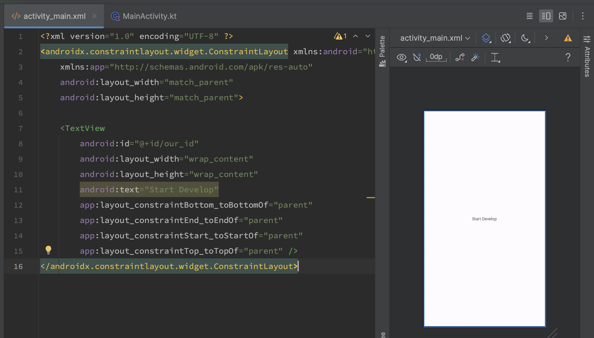
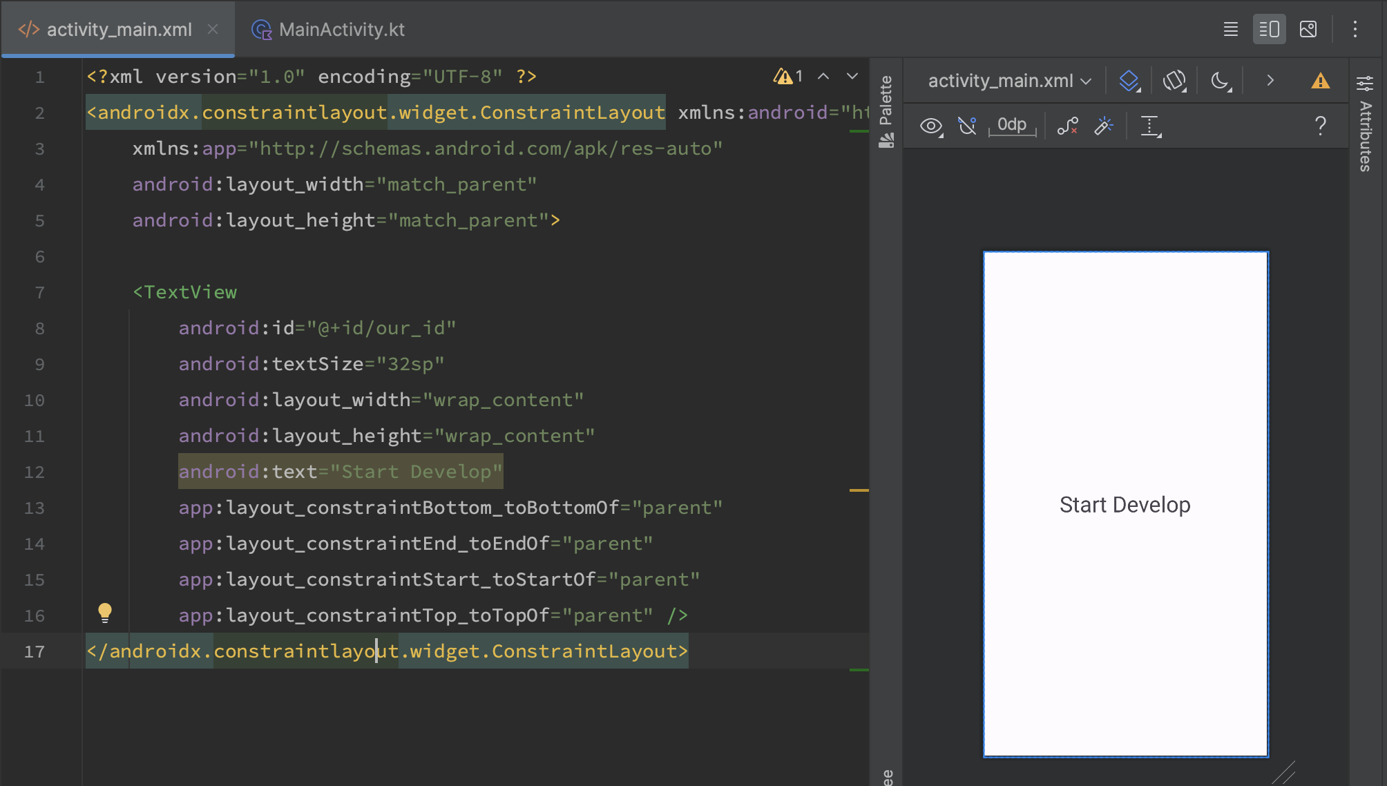
Disregard the app:layout_constraint parameters and sequentially add attributes:
android:textSize="32sp"
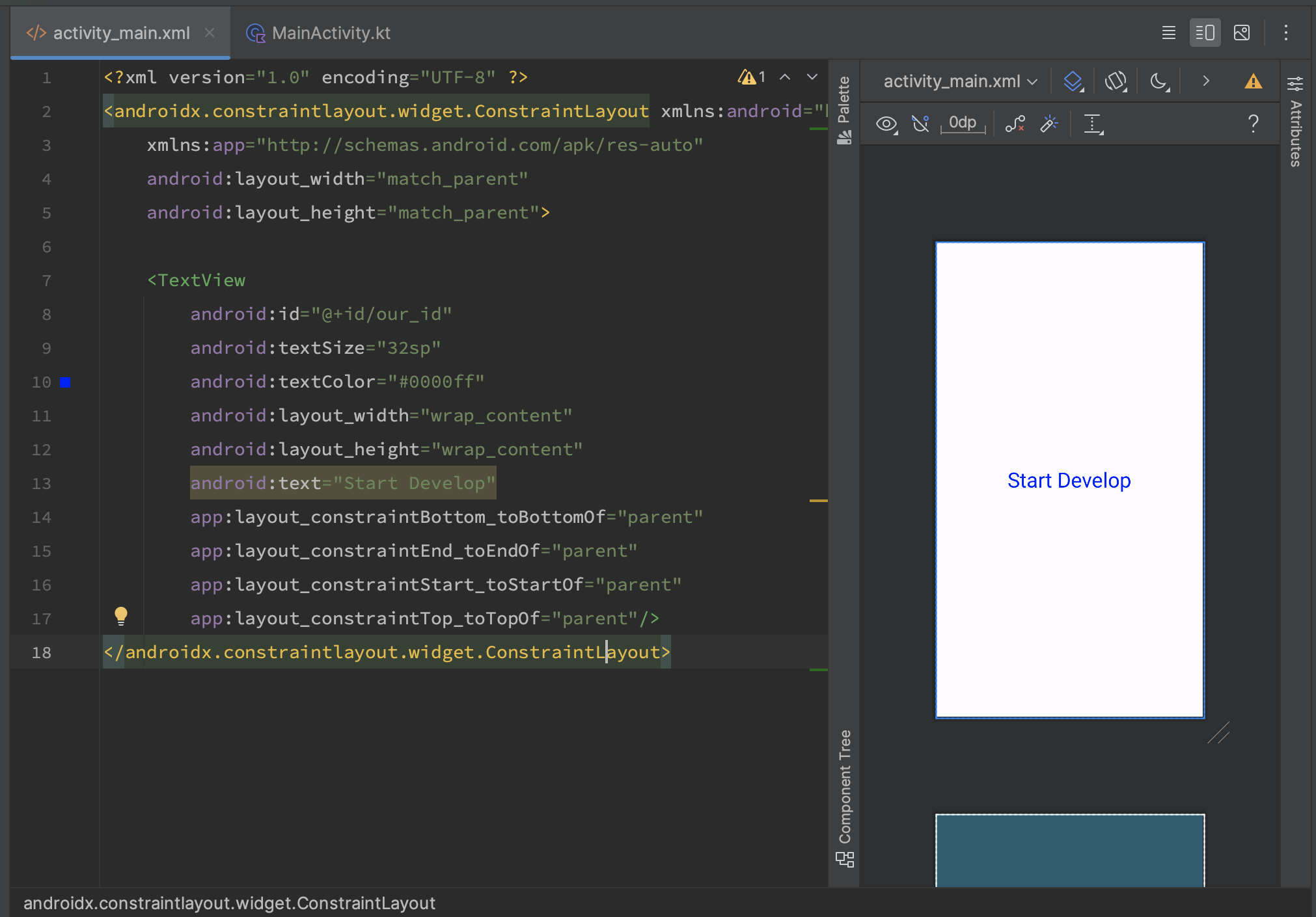
android:textColor="#0000FF"
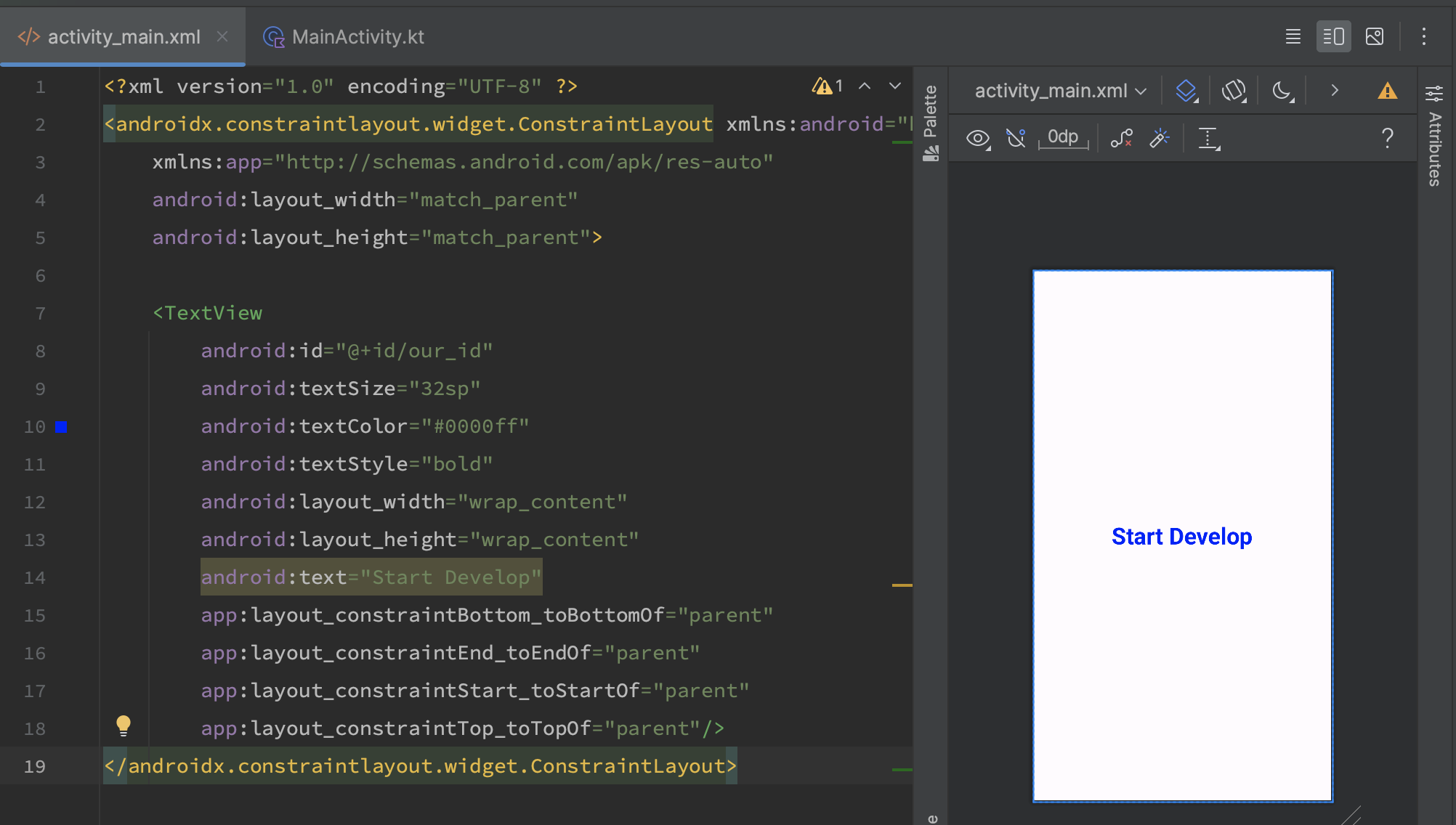
android:textStyle="bold"
android:gravity
The main values for the gravity attribute are:
- android:gravity="center_vertical": Vertically centers the text in TextView.
- android:gravity="center_horizontal": Horizontally centers the text in TextView.
- android:gravity="start": Aligns the text to the left.
- android:gravity="end": Aligns the text to the right.
Multiple gravity parameters can be applied by listing them using the "|" symbol. For a more detailed understanding of how gravity works, we also need to set rigid dimensions and a background for TextView. It looks like this:
Set parameters:
android:layout_width="300dp"
android:layout_height="300dp"
android:gravity="center_vertical|end"
android:background="#D3A54A"
And it looks like this:
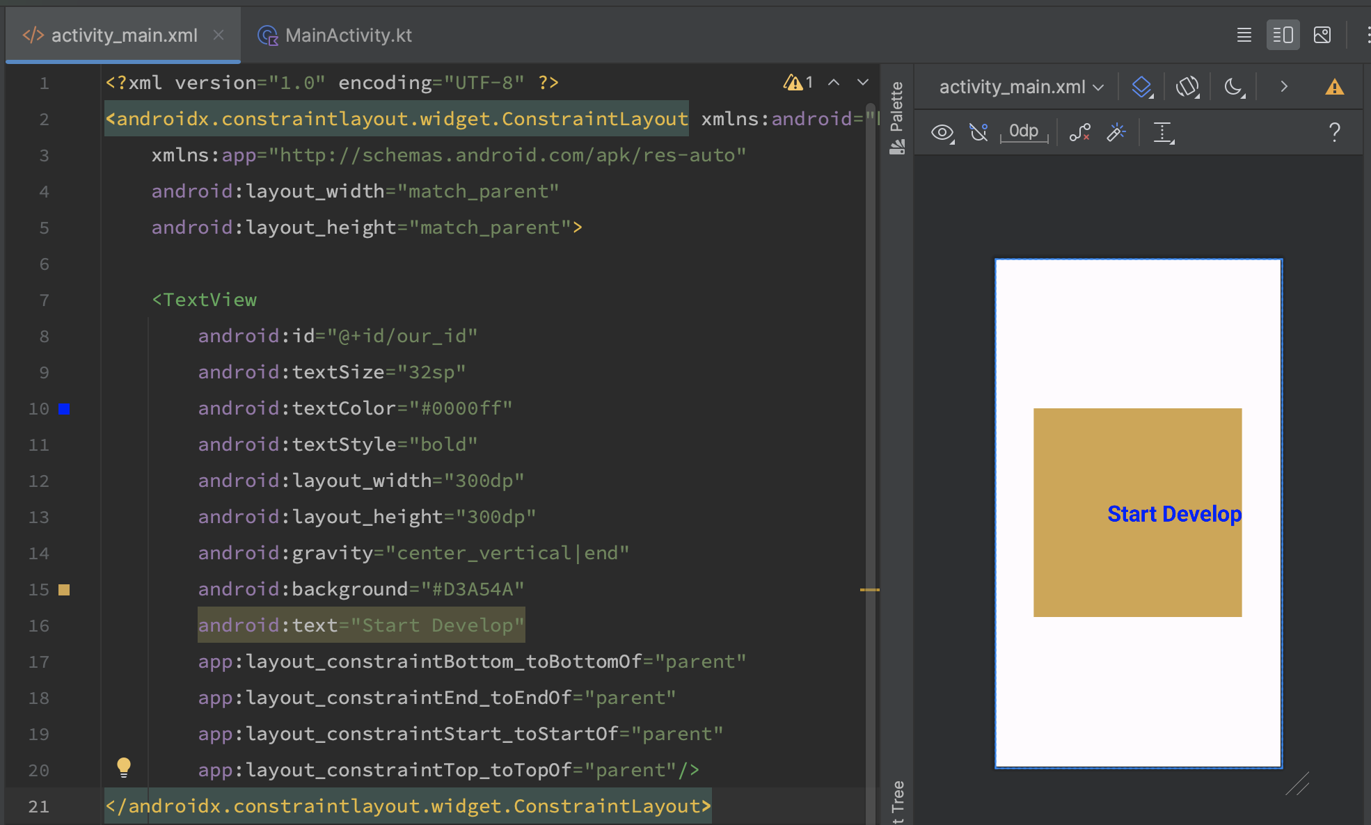
By using the background, we see the boundaries of our TextView. We also see that our text is vertically centered and aligned to the right.
android:lines and android:ellipsize
These two attributes work in tandem. Lines set how many lines TextView will render, and ellipsize defines the behavior for long text that won't fit. I'll use ellipsize="end," which automatically adds ellipses at the end of the text.
And it looks like this:
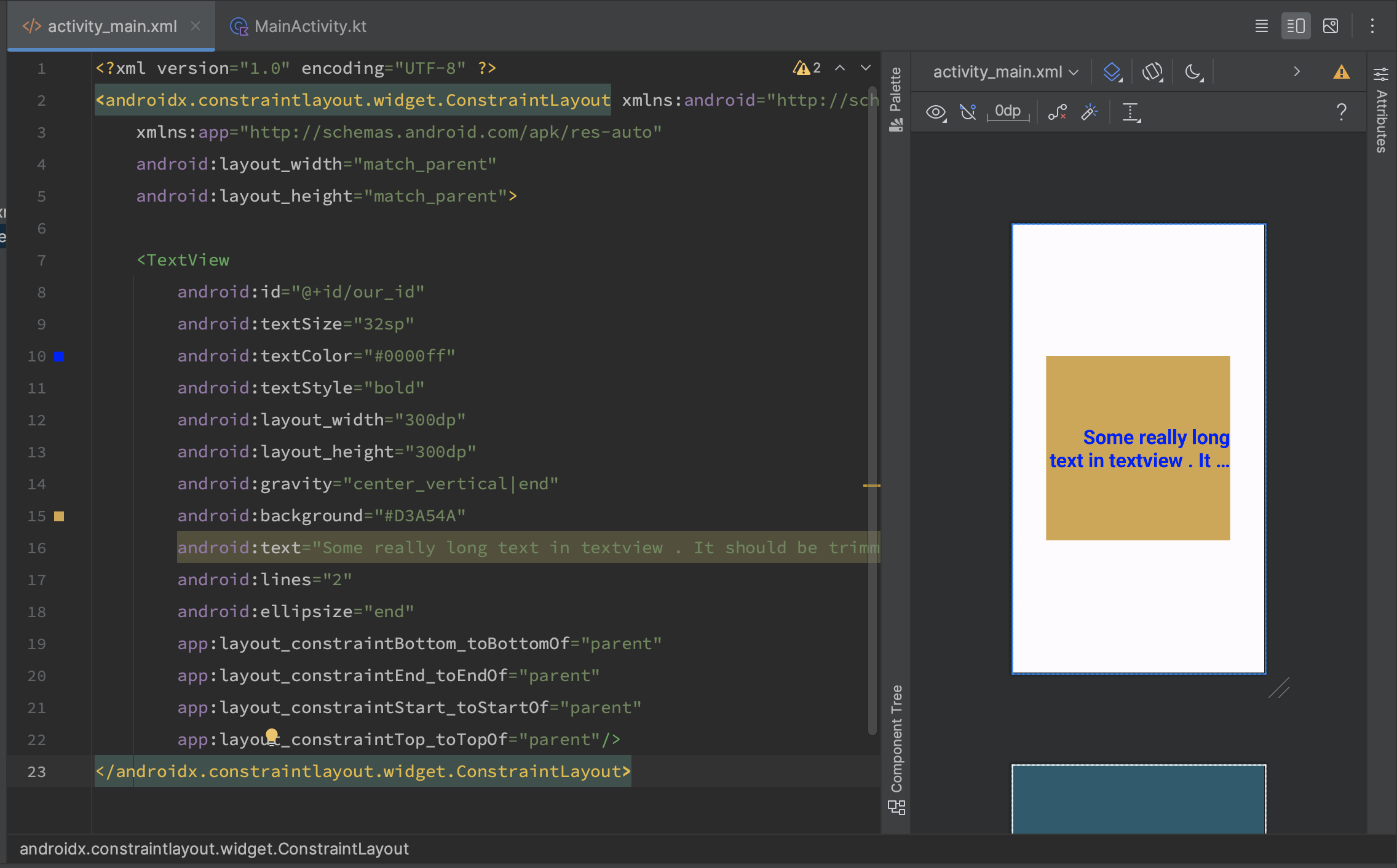
We've covered the basic attributes used in TextView. In the next lesson, we'll explore EditText - the element for text input from the keyboard.
Have a question? Ask our community in Telegram - Start-Develop RU / Start-Develop EN