Android XML: Arrangement of elements. ConstraintLayout
So, we learned how to set width and height for different UI elements and even tried to use base container - LinearLayout. As it was described before - there are 2 main layputs for designing UI elements - ConstraintLayout and LinearLayout.
In this article, we will explore how to use ConstraintLayout for designing user interfaces in Android. ConstraintLayout is a powerful container that allows you to position elements relative to each other or the boundaries of the container it resides in, such as its parent.
ConstraintLayout is a container that enables you to arrange elements relative to each other or the boundaries of the container. In other words, you can specify that an element's left edge should align with the left edge of something (either the parent or another element), and the same applies to the top edge and other edges.
Let's take a look at a list of attributes used in ConstraintLayout to position elements:
- app:layout_constraintBottom_toBottomOf="" - The element's bottom edge aligns with the bottom edge of something.
- app:layout_constraintBottom_toTopOf="" - The element's bottom edge aligns with the top edge of something.
- app:layout_constraintStart_toStartOf="" - The element's left edge aligns with the left edge of something.
- app:layout_constraintStart_toEndOf="" - The element's left edge aligns with the right edge of something.
- app:layout_constraintEnd_toEndOf="" - The element's right edge aligns with the right edge of something.
- app:layout_constraintEnd_toStartOf="" - The element's right edge aligns with the left edge of something.
- app:layout_constraintTop_toTopOf="" - The element's top edge aligns with the top edge of something.
- app:layout_constraintTop_toBottomOf="" - The element's top edge aligns with the bottom edge of something.
You may have noticed that we used to use the prefix "android:" before, but now it's "app:". That's correct. ConstraintLayout is not a part of Android itself; it's a library released by Google. In modern Android projects, many libraries, including ConstraintLayout, are already included by default. You can find them in the app/build.gradle.kts file under the line implementation(libs.constraintlayout).
The values for these attributes can be "parent" or “id” - the unique identifier of an element. We haven't used ids yet, but we'll cover them in the next lesson.
You might also have noticed that "start" corresponds to the left edge, and "end" corresponds to the right edge. In Android, this is the convention for defining sides.
ConstraintLayout allows us to create responsive layouts, meaning that elements adapt to different screen sizes without breaking their relative positions.
Let's make this clearer by modifying our activity_main.xml file as follows:
<?xml version="1.0" encoding="utf-8"?>
<androidx.constraintlayout.widget.ConstraintLayout xmlns:android="http://schemas.android.com/apk/res/android"
    xmlns:app="http://schemas.android.com/apk/res-auto"
    xmlns:tools="http://schemas.android.com/tools"
    android:layout_width="match_parent"
    android:layout_height="match_parent"
    tools:context=".MainActivity">

    <Button
        android:layout_width="wrap_content"
        android:layout_height="wrap_content"
        android:text="Start Develop"
        app:layout_constraintStart_toStartOf="parent"
        app:layout_constraintEnd_toEndOf="parent"
        app:layout_constraintTop_toTopOf="parent"
        app:layout_constraintBottom_toBottomOf="parent"/>
</androidx.constraintlayout.widget.ConstraintLayout>
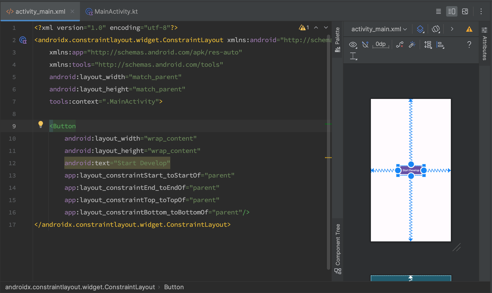
And let's see the result:

Here, we have a root ConstraintLayout element with a single button inside it. We've already covered attributes like android:layout_width, android:layout_height, and android:text, but now we see new attributes specific to ConstraintLayout:
- app:layout_constraintStart_toStartOf="parent" - Specifies that our Button's left edge should align with the left edge of its parent.
- app:layout_constraintEnd_toEndOf="parent" - Specifies that our Button's right edge should align with the right edge of its parent.
- app:layout_constraintTop_toTopOf="parent" - Specifies that our Button's top edge should align with the top edge of its parent.
- app:layout_constraintBottom_toBottomOf="parent" - Specifies that our Button's bottom edge should align with the bottom edge of its parent.
You might wonder why we instructed the Button to align its left and right edges with the parent's left and right edges, as well as its top and bottom edges. By logic, the Button should stretch. However, ConstraintLayout doesn't calculate element sizes; it only positions them. That's why our Button appears centered, suspended by what look like blue ropes. These ropes represent the relationships between elements, providing a visual representation of our layout.
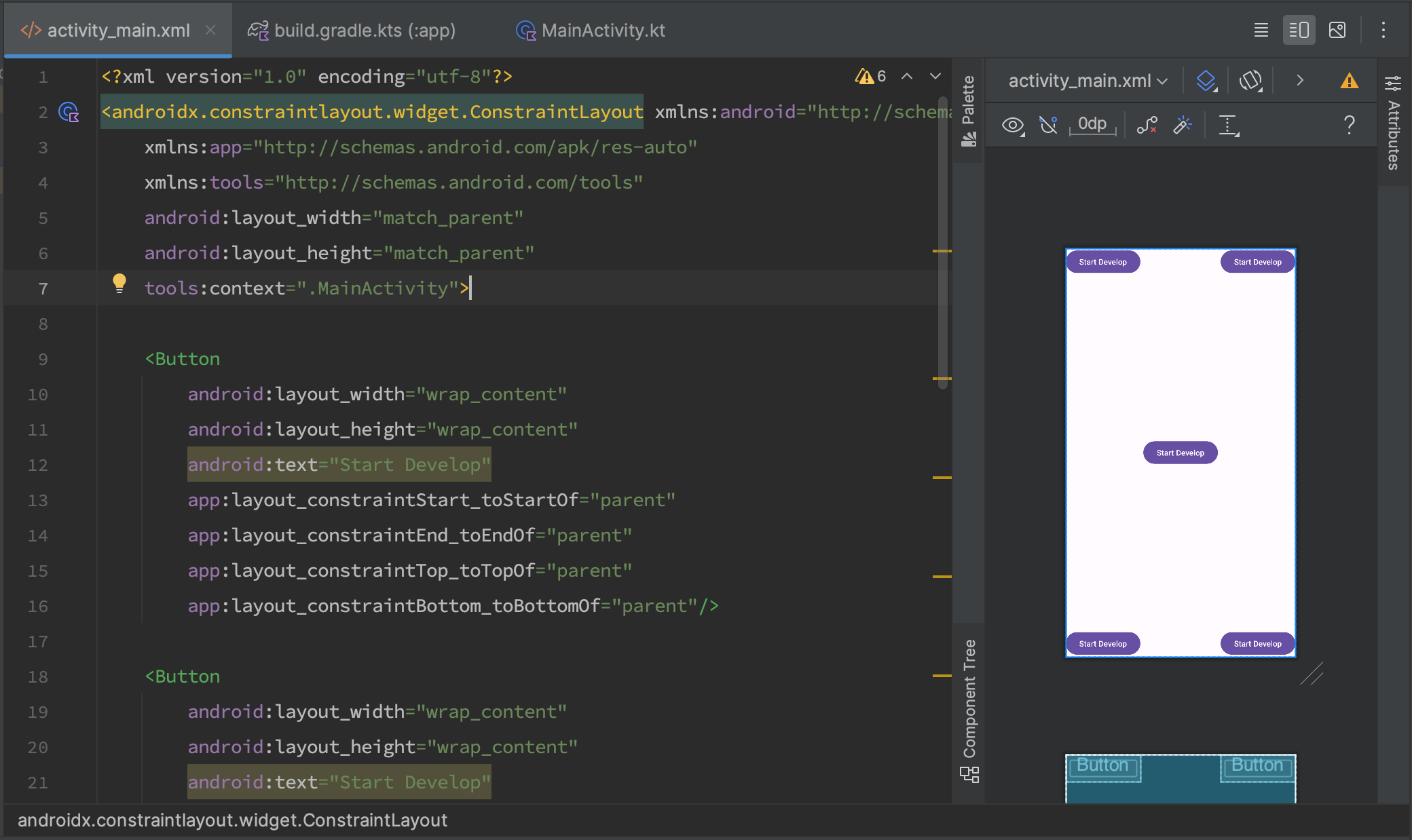
Now, let's create something resembling the number 5 on a gaming die by positioning four more elements in the corners. To do this, we'll add four more Buttons, each with two constraints. Here's what we have:
<?xml version="1.0" encoding="utf-8"?>
<androidx.constraintlayout.widget.ConstraintLayout xmlns:android="http://schemas.android.com/apk/res/android"
    xmlns:app="http://schemas.android.com/apk/res-auto"
    xmlns:tools="http://schemas.android.com/tools"
    android:layout_width="match_parent"
    android:layout_height="match_parent"
    tools:context=".MainActivity">

    <Button
        android:layout_width="wrap_content"
        android:layout_height="wrap_content"
        android:text="Start Develop"
        app:layout_constraintStart_toStartOf="parent"
        app:layout_constraintEnd_toEndOf="parent"
        app:layout_constraintTop_toTopOf="parent"
        app:layout_constraintBottom_toBottomOf="parent"/>

    <Button
        android:layout_width="wrap_content"
        android:layout_height="wrap_content"
        android:text="Start Develop"
        app:layout_constraintStart_toStartOf="parent"
        app:layout_constraintTop_toTopOf="parent"/>

    <Button
        android:layout_width="wrap_content"
        android:layout_height="wrap_content"
        android:text="Start Develop"
        app:layout_constraintStart_toStartOf="parent"
        app:layout_constraintBottom_toBottomOf="parent"/>

    <Button
        android:layout_width="wrap_content"
        android:layout_height="wrap_content"
        android:text="Start Develop"
        app:layout_constraintEnd_toEndOf="parent"
        app:layout_constraintTop_toTopOf="parent"/>

    <Button
        android:layout_width="wrap_content"
        android:layout_height="wrap_content"
        android:text="Start Develop"
        app:layout_constraintEnd_toEndOf="parent"
        app:layout_constraintBottom_toBottomOf="parent"/>
</androidx.constraintlayout.widget.ConstraintLayout>
This arrangement looks like:

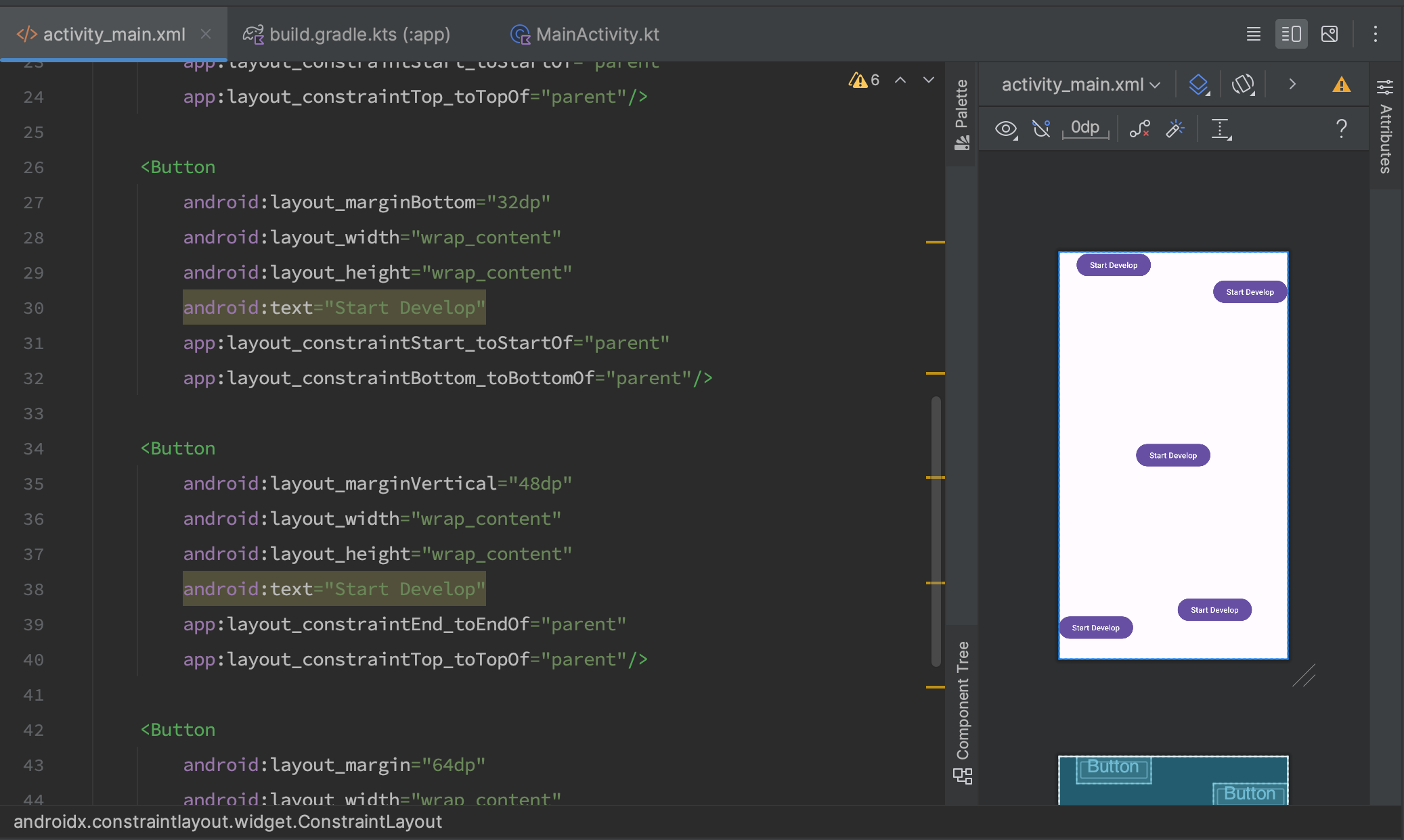
Not always do we want elements to align perfectly. Sometimes we need to add margins. You can achieve this using the android:margin attribute. There are seven margin attributes in total:
- android:layout_margin="" - Margin on all sides.
- android:layout_marginTop="" - Margin at the top.
- android:layout_marginBottom="" - Margin at the bottom.
- android:layout_marginStart="" - Margin at the left.
- android:layout_marginEnd="" - Margin at the right.
- android:layout_marginVertical="" - Vertical margin, both top and bottom.
- android:layout_marginHorizontal="" - Horizontal margin, both left and right.
So lets add margin attributes for required elements and how it looks like. Here what i have:

I don't give you ull code snippet. Now, it's your turn to experiment and create a complete example. Consider this as your homework to practice what you've learned.
Have a question? Ask our community in Telegram - Start-Develop RU / Start-Develop EN